Choosing the Right Wood Stain
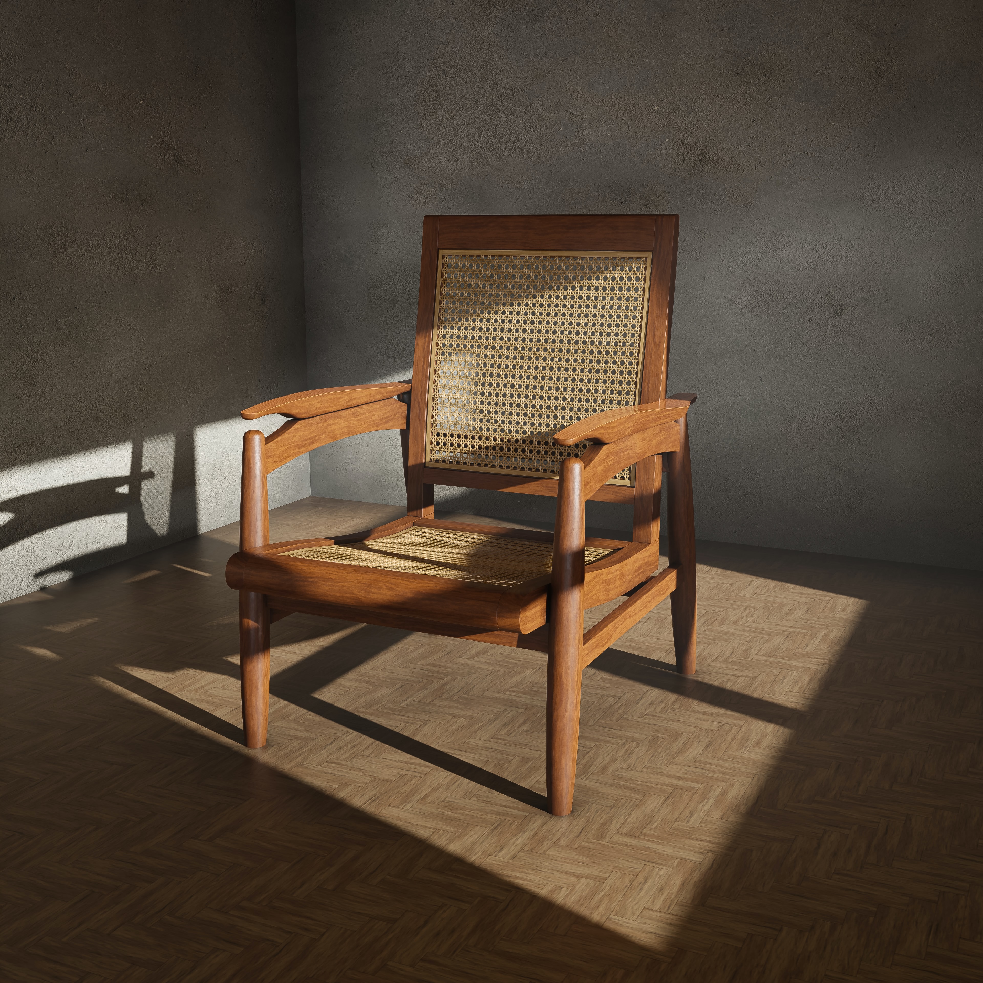
For custom furniture, stain is rarely a standalone color decision. It is part of the broader material language of a piece: how the grain presents, how the undertone sits against adjacent finishes, and how the work will read once installed under the project’s actual light.
At Mesa & Maple, we treat stain as one part of a full finish specification shaped in collaboration with the design team. Species, cut, milling, sanding sequence, stain system, sheen, and topcoat all influence the final read. The samples below are useful for direction, but approval should always happen on the actual wood and construction approach selected for the project.

Begin with the wood species
Across custom work, species remains the first and most consequential variable. The same stain formula can present with very different value, contrast, and undertone depending on pore structure, base color, grain orientation, and how the stock was milled.
OAK...
tends to hold pigment in a way that makes the grain pattern part of the finish story. With stains such as Weathered Oak, Golden Oak, Red Oak, or Provincial, the earlywood and open pores can create pronounced movement, which may be exactly right for a piece that benefits from texture and visual depth. In more restrained applications, that same response may need to be moderated through sample review and finish adjustment.
MAPLE...
typically reads more controlled and refined, but that restraint comes with its own considerations. Finishes such as Colonial Maple, Honey, or Golden Pecan can feel clean and luminous, while deeper tones often land as more tailored than expressive. Because maple can take color unevenly, especially across boards with differing figure, the approval sample should reflect the actual board selection and surface preparation strategy whenever possible.
PINE...
and other softer species can produce a beautiful warmth with finishes such as Ipswich Pine, Early American, or Gunstock, though they require close attention if the goal is a sophisticated, even read rather than a more rustic expression. On those species, the difference between intentional variation and unwanted blotching is often resolved long before stain is applied.
Natural base color matters just as much. A warmer species can pull a gray finish toward taupe or olive; a pale substrate can make a medium brown feel more transparent and lifted.
For that reason, printed charts and digital references are best treated as directional rather than definitive. The specification really comes into focus only once the finish is tested on the intended species.
Understanding the character of the wood stain sample palette
The sample palette is most useful when read less by label and more by behavior. Tonal family matters, but so does the way each finish amplifies or suppresses grain, how it sits beside other architectural materials, and whether it reads as transparent, saturated, or intentionally quiet.
Pale & Softened Neutrals
Hazelwood, Weathered Oak, Smoke Gray, and Classic Gray tend to work when the brief calls for subtlety rather than overt color. They can preserve openness while still giving the piece a finished point of view.
Hazelwood often lands as soft warmth without becoming obviously honeyed. Weathered Oak can introduce a lightly aged cast, particularly on open-grained stock where the texture remains visible. Smoke Gray and Classic Gray can be effective in cooler or more mineral palettes, but they usually benefit from disciplined sample review because they are highly responsive to substrate and context.
This is especially true of gray-forward stains. Depending on species and lighting, they may shift toward mushroom, taupe, silvered brown, or even a faint blue-green cast. They also tend to be affected quickly by neighboring materials. Beside warm plaster, ivory upholstery, or unlacquered brass, they can feel cooler and more deliberate; beside dark stone or blackened steel, they often settle into a more neutral register.
Natural & Golden Tones
Poly Only, Golden Pecan, Golden Oak, Ipswich Pine, Colonial Maple, and Honey sit in the warmer half of the palette, but they are not interchangeable. Each creates a different balance between naturalism, glow, and period association.
Poly Only is often the strongest move when the species itself is carrying the design. On a well-selected white oak, maple, or walnut, a clear finish can preserve the integrity of the material and keep the piece from feeling over-directed. In collaborative specification work, this choice is often less about simplicity and more about confidence in the wood selection.
Golden Pecan and Honey can add warmth without too much visual weight. Golden Oak and Ipswich Pine usually read more familiar and more overtly warm, while Colonial Maple can introduce a gentler amber note.
In practice, the distinction is often about restraint: whether the finish supports surrounding materials or begins to announce itself too strongly against them.
The key with this family is not simply choosing warmth, but controlling the type of warmth. A finish can be warm and still feel tailored; it can also tip too yellow or too orange once it is placed beside flooring, stone, or existing cabinetry. That threshold is usually best judged through side-by-side material review rather than by stain name alone.
Rich Reds & Classic Mid-Tones
Antique Walnut, Red Chestnut, Gunstock, Sedona Red, Cherry, Red Oak, Special Walnut, and English Chestnut offer more body and more visible color signature. They can be particularly effective where the furniture is expected to contribute richness, not just blend.
Antique Walnut and Special Walnut are often reliable when a project needs a medium brown with presence but not the density of a near-black finish.
Red Chestnut, Sedona Red, Cherry, and Gunstock carry more overt russet or red influence, which can be compelling in layered interiors with patinated metals, antique references, or deeper textile palettes.
English Chestnut often sits in a useful middle position. It has enough depth to articulate grain and profile, but it can still read as wood rather than as color alone. That balance is often what makes it useful across casegoods, dining pieces, and built-ins where designers want richness without opacity.
Deep Browns & Near-Black Finishes
Dark Walnut, Provincial, Jacobean, Espresso, Ebony, and Classic Black introduce a stronger architectural stance. They can ground a room, sharpen silhouettes, and create a more graphic relationship to pale walls, upholstery, or stone.
Dark Walnut and Jacobean often hold onto some legibility in the grain while still bringing substantial depth. Espresso reads more contemporary in many settings, while Ebony and Classic Black push closest to a dramatic, near-opaque effect. These finishes can be very effective on sculptural forms, built-ins that need to feel integrated with dark architectural elements, or pieces intended to anchor a quieter palette.
They also demand the most discipline in fabrication and review. As the finish deepens, sanding inconsistency, board-to-board variation, glue contamination, and changes in grain absorption become more visible rather than less. For darker specifications, mockups and approval samples are often where the design intent is truly protected.
Consider atmosphere, not just coordination
In specification work, exact matching is often less useful than tonal alignment. A new piece does not necessarily need to duplicate adjacent flooring or millwork to feel resolved within the room. In many projects, a finish that sits in conversation with surrounding woods rather than replicating them produces a more considered result.
Lighter Schemes
Poly Only, Weathered Oak, Hazelwood, or Classic Gray can preserve clarity while still giving the furniture enough presence to avoid disappearing into the envelope.
Warm Schemes
Golden Pecan, Honey, Special Walnut, or English Chestnut often provide a more dimensional alternative to a direct match, especially when the project includes stone, woven textures, or aged metals.
Darker Schemes
Antique Walnut, Cherry, Red Chestnut, or Dark Walnut can add density and a sense of permanence.
For more graphic compositions, Smoke Gray, Espresso, Ebony, or Classic Black can establish a sharper relationship between the furniture and the architecture.
Sheen is part of that conversation as well.
A matte or low-sheen system generally reads quieter and more material-forward. Satin often provides enough polish for custom furniture without introducing unnecessary reflectivity. Higher sheens can be useful, but they tend to make both grain activity and surface variation more apparent, which should be intentional.
Always approve a physical sample
For custom work, a sample is not just color confirmation. It is where finish intent, material behavior, and fabrication reality are brought into alignment before production moves forward.
For each project, we recommend reviewing samples that reflect:
The exact wood species selected
The intended surface preparation
The chosen stain
The planned topcoat and sheen
The approximate scale and construction of the finished piece
Just as important, samples should be reviewed in relation to the actual project palette: flooring, stone, paint, textiles, hardware, and any adjacent millwork or cabinetry. A stain that feels balanced in isolation can shift noticeably once it is placed beside the room’s real materials and under the lighting conditions the finished piece will live in.
This is also where coordination matters. If a built-in must relate to existing trim, if a dining table needs to sit comfortably with antique seating, or if a vanity finish has to bridge cabinetry and stone, the sample review stage is where those relationships are resolved with confidence. It is often the difference between a finish that is merely attractive and one that feels fully integrated into the project.
A thoughtful finish creates lasting character
The strongest finish specifications do not compete with the wood or the room. They clarify both, allowing the piece to feel fully integrated with the larger design language of the project.
Whether the direction is a clear Poly Only finish, the softened neutrality of Weathered Oak, the warmth of Golden Pecan, the depth of Special Walnut, or the drama of Ebony, the objective is the same: a piece that reads as intentional, bespoke, and fully resolved in context.
Mesa & Maple collaborates with interior designers on custom furniture and built-ins where finish development, sample review, and fabrication detail are part of the design process from the start. If you’d like to review wood species, stain direction, and project-specific finish options together, schedule a design consultation.


Comments